
The Essential Visualization Toolkit for LLM Metrics
Depending on what you're trying to prove, some charts work better than others. Using the wrong one doesn't just make your report look bad; it can lead you to pick the wrong model for your production environment.Bar Charts for Quick Benchmarking
Bar charts are the workhorses of the industry. About 63% of evaluation papers use them because they are unbeatable for side-by-side comparisons. If you're looking at the
GLUE (General Language Understanding Evaluation) benchmark, a bar chart instantly shows you which model hits the highest score. However, be careful: they often hide uncertainty. If your model's score is 85% but the variance is huge, a simple bar doesn't tell that story.
Scatter Plots for Performance Trade-offs
In the real world, accuracy isn't the only thing that matters. You also care about speed and cost. Scatter plots are perfect for visualizing the tension between accuracy and inference time. For example, you might see GPT-4o hitting 89.7% accuracy at 120ms, while a smaller model hits 70% accuracy but responds in 30ms. This allows you to find the "sweet spot" for your specific use case.
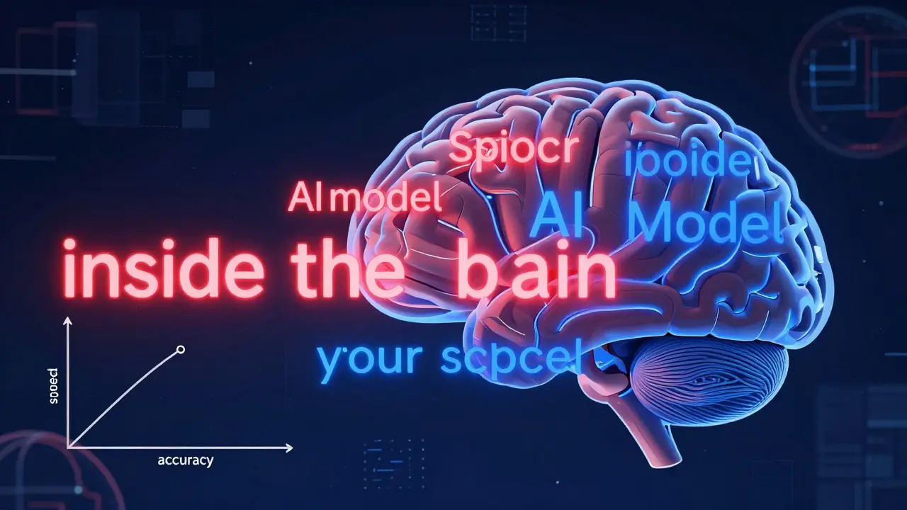
Token Heatmaps for "Inside the Brain" Analysis
If you need to know why a model is hallucinating or where it's focusing its attention,
Token Heatmaps are
visualizations that use color gradients to highlight the importance weights of individual tokens in a model's output
. Typically, red indicates high importance (values >0.8) and blue indicates low importance. These are incredibly powerful for debugging reasoning chains, though they require a bit more expertise to read without getting overwhelmed.
Line Charts for Iteration Tracking
When you're fine-tuning a model, you need to see the trend. Line charts track how a metric like the
MMLU (Massive Multitask Language Understanding) score evolves as you increase parameter counts. For instance, Llama 3 showed a significant jump from 38.2 to 52.8 as it scaled from 7B to 70B parameters.
| Technique | Best Use Case | Key Strength | Major Weakness |
|---|---|---|---|
| Bar Chart | Comparing 2-5 models | Instant ranking | Hides uncertainty/variance |
| Scatter Plot | Accuracy vs. Latency | Reveals correlations | Limited to 2-3 dimensions |
| Heatmap | Token-level debugging | Explains "why" | Steep learning curve |
| Parallel Coordinates | Multi-metric assessment | Holistic view | Visual clutter (over 300 pts) |
Advanced Frameworks for High-Dimensional Data
When you're tracking 12 different metrics across 500 test cases, a bar chart is useless. You need something that can handle high-dimensional space without becoming a "hairball" of lines.One of the most effective tools for this is EvaLLM is a visualization framework that employs interactive parallel coordinates to display multi-dimensional evaluation results simultaneously . Instead of flipping through ten different charts, you can see how a single model performs across accuracy, fairness, robustness, and toxicity all in one view. Just a heads-up: these interactive views usually require WebGL-enabled browsers and can start to lag once you hit about 500 data points.
Then there's LIDA (Language-Integrated Data Analysis), which focuses on automating the process. LIDA uses an LLM to decide which chart type best fits your data and then generates it. It's great for speed, but as some users on Reddit have pointed out, the "Infographer" can sometimes prioritize aesthetics over raw analytical accuracy. If you need pinpoint precision, stick to something like NL4DV, which generates Vega-Lite outputs that are more basic but generally more accurate.
The "Accuracy Trap": Common Mistakes in AI Visualization
It's easy to create a chart that looks impressive but lies to you. The biggest culprit is the failure to represent uncertainty. About 78% of current visualization techniques ignore uncertainty intervals. If your evaluation was run on a small sample size, that "winning" bar might actually be a statistical fluke. Always look for error bars or shaded confidence intervals. Another common issue is visual clutter. When developers try to jam too many dimensions into one plot, the result is unusable. The solution is often dimensionality reduction-using techniques like PCA or t-SNE to compress complex data before plotting it. About 42.7% of successful enterprise implementations use this to keep their dashboards clean. Finally, be wary of "aesthetic-first" design. As John Stasko from Georgia Tech has noted, many tools prioritize a sleek look over analytical utility. A beautiful dashboard that hides the model's failures is a liability, not an asset.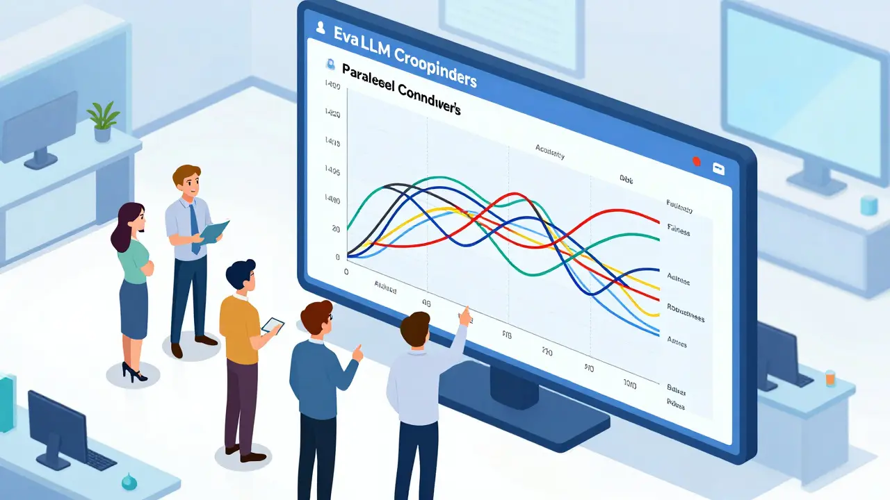
Practical Implementation Guide
If you're ready to start visualizing your results, you don't need a PhD in data science, but you do need a specific stack. Most practitioners spend 15-25 hours a week just on custom visualizations, but you can cut that down by using the right libraries.The Technical Setup:
- Language: Python 3.8+ is the standard.
- Libraries: Start with
matplotlibandseabornfor static plots. Move toplotlyorbokehfor interactive dashboards. - Frameworks: Use
lm-evaluation-harnessto get your raw data before feeding it into a tool like EvaLLM or LIDA. - Hardware: If you're using interactive multi-dimensional tools, 16GB of RAM is the bare minimum to avoid browser crashes.
Pro Tip: Create a standardized color palette for your team. One of the most common frustrations in enterprise AI teams is having different colors for "Success" across different reports (e.g., green in one, blue in another). Standardizing this simple detail reduces cognitive load and prevents misinterpretation.
Which visualization tool is best for beginners?
For those starting out, LIDA is highly recommended because it automates the choice of visualization based on your data. However, if you prefer accuracy over automation, NL4DV is a better choice as it produces reliable Vega-Lite charts.
How do I handle too many evaluation metrics in one chart?
The best approach is to use Parallel Coordinates plots, as seen in the EvaLLM framework. If the chart becomes too cluttered (usually around 300+ points), apply dimensionality reduction techniques or use interactive filtering to isolate specific model groups.
What is the difference between a token heatmap and a bar chart in LLM eval?
A bar chart shows *what* the final score is (e.g., 80% accuracy), whereas a token heatmap shows *how* the model reached that conclusion by highlighting which specific words (tokens) the model weighted most heavily during generation.
Why is uncertainty representation so important?
Without uncertainty intervals, you might mistake a lucky run for a genuine model improvement. Representing variance helps you understand if a model is consistently good or just sporadically lucky on a specific benchmark.
Can these techniques work for multimodal models (image/audio)?
Yes, but it's more complex. New techniques are emerging (such as those being presented at IEEE VIS 2025) that focus on cross-modal evaluation, allowing researchers to visualize how an LLM connects a text prompt to a specific region of an image.
Nathaniel Petrovick
April 22, 2026 AT 04:32Actually had a bit of a struggle with the LIDA infographer last month, it definitely leans more towards looking pretty than actually being useful. I've been sticking with plotly for my dashboards since I can actually control what's happening with the data. Great breakdown of the different chart types though!
Jane San Miguel
April 22, 2026 AT 12:59It is quaint that one would assume most practitioners lack the mathematical rigor to understand uncertainty intervals without a visualized guide. In professional circles, we simply do not deploy models based on raw means; it is fundamentally amateurish to do so. I find the suggestion of using LIDA for beginners to be somewhat patronizing to the intelligence of the field, as a basic understanding of Vega-Lite is hardly a barrier to entry for anyone with a modicum of technical competence. Furthermore, the emphasis on 'aesthetic-first' design is a straw man argument when the industry standard has always been functional minimalism.
Honey Jonson
April 23, 2026 AT 11:24love the tips on the color palette!! its so true that teams just pick random colors and then every1 is confused lol
Sara Escanciano
April 23, 2026 AT 13:45This guide completely ignores the ethical disaster of using these tools to mask bias. You can make a scatter plot look amazing while your model is essentially a prejudice-engine. It is absolutely disgusting how the industry prioritizes 'efficiency' and 'latency' over the actual moral implications of the output. Stop obsessing over whether the chart is 'cluttered' and start worrying about whether your model is destroying societal norms!
Sally McElroy
April 23, 2026 AT 20:44The obsession with visualization is just another layer of distance between us and the truth... We create these beautiful maps to avoid facing the fact that we are just rearranging tokens in a void... The 'accuracy trap' isn't just about statistics, it's a metaphor for the human condition!!!
Destiny Brumbaugh
April 25, 2026 AT 15:12US tech is lightyears ahead of the rest of the world anyway!! No matter what tool u use, our infra is just bettr and that's why we win. Keep pushin the limits of these LLMs and keep it American made!!